Lighting part 2 - shadows
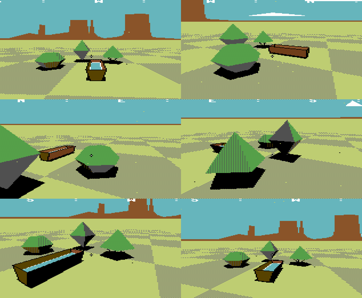
Should shadows should be part of the Bad Pixels look? Old 3D games seemed like they didn't use shadows. If you look a little closer, it seems that most games did try to use shadows in their own way. Various tricks got used for performance.
Take the humble blob shadow. This simple fellow is useful enough in games to give a sense of where an object is in 3D space. How would this be in a time before textured polygons? Often it would take the form of a set of triangles that resemble the objects shape. Laid flush with the ground and filled.
Games would use this method in various ways, from a simple quad to a height flattened version of the object. But what happens if you encounter uneven ground? Well... floating shadows happen.
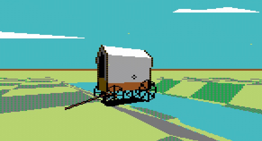
This was the original approach in Bad Pixels. It seemed a more robust solution was needed. Why not use Unity's shadows? Unity's built-in shadow system, is a one-size-fits-all solution. While advanced for most use cases, it offers little in the way of customisation for fringe cases. (Bad Pixels uses custom lighting). Let's look at some alternative solutions:
Solution 1: stencil buffer.
Inspired by a technique seen in Game Cube and Wii games, 3D models can be stencil-ed through geometry. The shadows would be extremely crisp, being polygons themselves. They can move up and down and scale in footprint to relay distance from the ground.
The idea is that a 3D model can have its upper intersecting pixels discarded. Then any pixels that are intersecting with geometry can be drawn in-front of that geometry. There are various mix methods, and it works very well if you only have one object doing this. Actually this is in use on the tumbleweeds video.
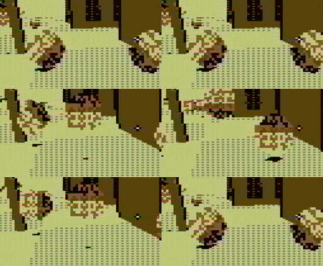
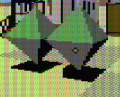
Where this technique has issues though is when more than one shadow object is near another. The discarded pixels become a mask for the other other objects and the whole effect starts to fall apart.

A lot of time was spent trying to find a solution to this, sadly it looks like there is a limit to this technique.
Time to move on. Let's look at an alternative technique from an old game:
Solution 2: projected geometry.
In the 1987 game "Zarch", projection shadows were made by casting the shape of an object down with rays. Drawing a filled polygon into the casted shape. The author, David Braben, remarked at the time that the only drawback to this technique was that for uneven geometry, the effect cut through slopes.

We are back to the original technique of having flat geo following the object, so it is time to move on. Let's see what a texture can do:
Solution 3: projection shadows.
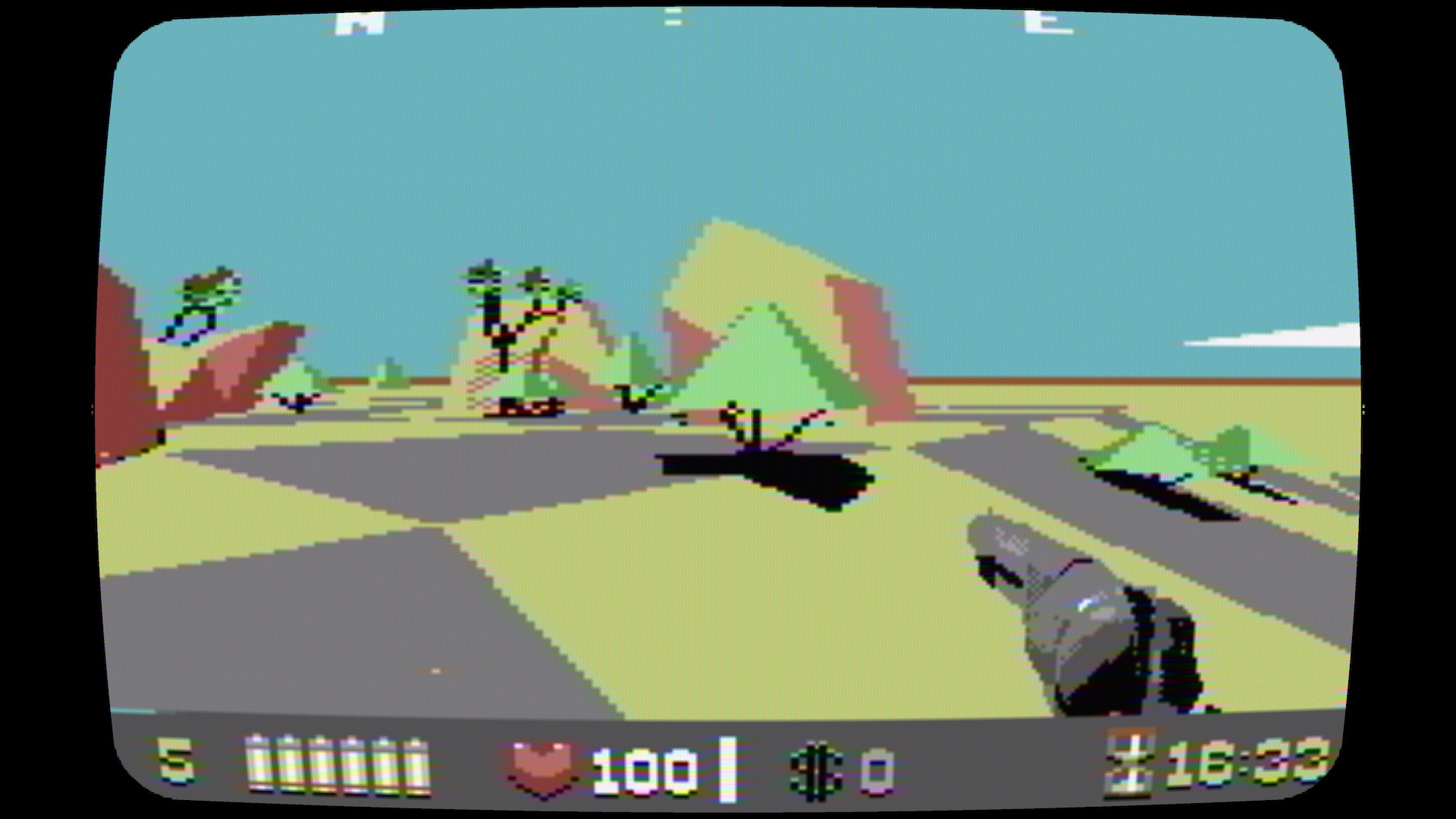
This technique is how Unity makes shadows. A camera is set where the light-source would be. Anything the camera cannot see is coloured black and then applied as a texture. In this solution--as something much simpler was acceptable--Bad Pixels is using a chroma-key colour as the "seen" part. Everything else is coloured black and applied as a frag pass texture over the seen area inside a camera frustum.
This process wasn't easy to set up... many quirks appeared! Finally after all the quirks were banished, it does offer a robust look. One that requires no extra asset modification. Uneven geometry is also supported. No more floating shadows.
Rejoice!
Get Bad Pixels
Bad Pixels
8-bit shoot-out in the old west
| Status | In development |
| Author | dadako |
| Genre | Action |
| Tags | 3D, 8-Bit, boomer-shooter, Commodore 64, FPS, Low-poly, Pixel Art, Retro |
| Languages | English |
| Accessibility | Subtitles |
More posts
- Demo release date, update your details & changes to itch.io page24 days ago
- The roadmapMay 22, 2025
- Weapons & where to shoot themMar 04, 2025
- console hudSep 22, 2024
- TerrainJul 18, 2024
- Lighting & the cutting room floorFeb 06, 2024

Comments
Log in with itch.io to leave a comment.
looks beautiful!
Forgot I preordered this. Still really excited!
I really love the aesthetic you're putting together for this project. The colors are so nice, and the low poly look of the landscape is awesome. Great work!
Looks great!
I think you're on the right path, looks awesome!