c64 styled 3D graphics
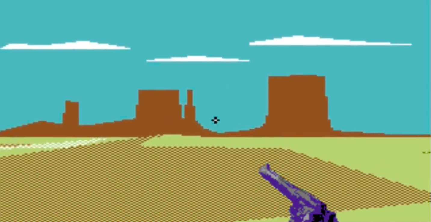
How should a Commodore64 inspired game be lit? Should it use realtime shadows? Textures?
These were some fundamental questions on the road to the final look. The answer is only known by trying all options, running polls on social media and making some hard decisions.
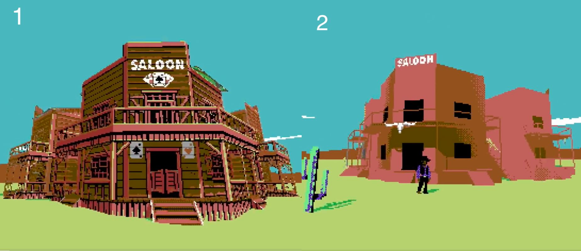
Initially I ran polls on Linkedin, Reddit and Twitter. The poll simply asked the question "which do you prefer?" In regards to flat shaded 3D, or textured 3D (above image). The result? Most voted for textured 3D (1), however it was the comments that really drove the conversation. While people voted for textured 3D, there were many observations that it did not suit a game that is commodore64 adjacent, a machine that could not muster up the graphics processing for such a task.
Thanks to all the feedback, Bad Pixels found its graphical place in the world:
- Flat shaded polygons. Dithered colours to make up for the limited palette of the c64.
- No lighting or shadows.
- Textures are ok if they are treated as scaling sprites.
- Use line drawing for details.
- Rendered in double width pixels.
- Scrolling image as skybox.
My handbook for such graphical examples exist over several platforms, not necessarily 8-bit:
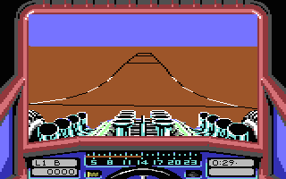
Stunt Car Racer (c64) | 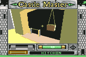 Castle Master (c64) |
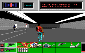
Die Hard (DOS) | 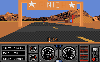 |
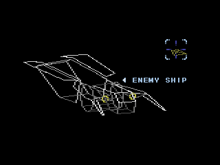
Ranger X aka Ex-Ranza (Mega Drive) |
From my earlier tests, I decided to remove all lighting, that will be baked in by my colour choices. This gives the game a more retro feel, and while it may take more time to make the props, the feel of the game will benefit as a whole. Here's where we are right now:
To get updates on this devlog, feel free to add this game or follow us.
Get Bad Pixels
Bad Pixels
8-bit shoot-out in the old west
| Status | In development |
| Author | dadako |
| Genre | Action |
| Tags | 3D, 8-Bit, boomer-shooter, Commodore 64, FPS, Low-poly, Pixel Art, Retro |
| Languages | English |
| Accessibility | Subtitles |
More posts
- Demo release date, update your details & changes to itch.io page25 days ago
- The roadmapMay 22, 2025
- Weapons & where to shoot themMar 04, 2025
- console hudSep 22, 2024
- TerrainJul 18, 2024
- Lighting part 2 - shadowsApr 15, 2024
- Lighting & the cutting room floorFeb 06, 2024

Comments
Log in with itch.io to leave a comment.
interesting thought process
the checkerboard pattern for the ground is a interesting solution to keep the sense of speed without reverting to textures - feels consistent.